legacy
There is a blue in our logo that belongs to one person.
It sits in the wordmark, on the website and in every document we send. It is there for a reason that has nothing to do with design trends. This is that story, and everything that grew out of it.
Chapter one The color that came first
Most companies choose a palette. Here it happened the other way around.
Legacy blue came from one of the founders. It carried personal significance long before it carried a company, and when the time came to decide what systech would look like, it was never really in question.
It became a bridge. On one side sits the deeply technical work, the migrations and the failovers and the calls that arrive before anyone has had coffee. On the other sits the profoundly human reason a person does that work at all. Legacy blue is the reassurance that every piece of technology deployed here carries a personal touch.
For a client it means something specific. You are not engaging a service provider. You are joining a story that was already being written.
Chapter two 2017. Roseburg.
The premise was almost stubborn: a business here should not have to import its IT department from Portland.
systech was founded in Roseburg in 2017 on exactly that idea. The co-founders brought roughly 70 years of combined leadership experience to a region that had long been told regional meant second tier. They did not open a call center. They built a team that lives here, and kept it that way: no offshore tiers, no rotating contractors, no escalation path that ends in a timezone nobody can pronounce.
Nine years on, what has held is simpler than a story about growth.
Same town. Same number. Still answered by someone who lives here.
Chapter three How it grew
Not a rocket. A road.
-
2017
The founders, one premise
systech is established in Roseburg to give Southwest Oregon businesses the caliber of support a Portland or Seattle firm takes for granted, delivered by people who live down the road.
-
2022
Room to work
The move to 435 NE Casper St. A bigger bench, a real staging area, and space for a team that had outgrown the room it started in.
-
2023
The brand gets written down
The Brand Identity Guide is published. Colors that had been carried by instinct for six years are given names, values and rules. Legacy blue is entered into the record.
-
2025
The coast
A second office opens at 125 Central Ave in Coos Bay. Not a satellite address on a website. Staff, on the coast, for coastal clients who were tired of waiting on someone to make the drive.
-
2026
Client success becomes a job, not a hope
Joe Goedereis is appointed Director of Client Success, a newly created role leading account managers Jonathan Walder and Morgan Haitsma. It formalizes what the team had been doing by instinct: planning ahead with clients rather than waiting for the call.
The break/fix era is over, and systech would rather help write what replaces it than wait to be told.
By 2023 there was a company, a reputation and a set of colors nobody had ever written down.
I did not design this brand so much as find it.
The color was already here. It belonged to one of the founders before it ever belonged to a company. The braces were already here too, left behind by people who wrote code before they ran a business. None of that was mine to invent, and none of it needed improving.
So the guide was never an exercise in starting clean. It was an exercise in looking hard at what was already true, and then giving it rules, so it would hold up on a business card, a truck door and a page like this one, and still mean exactly what it meant the first time somebody chose that blue.
Greg EkborgMarketing Director · author of the systech Brand Identity Guide
Chapter four Why the s is small
The lowercase is not a typo anyone stopped correcting.
It is a decision, and it holds everywhere: headlines, sentence openings, formal documents, a technician's email signature. When a sentence fights the rule, the sentence gets rewritten. The name does not.
What a small letter buys is a posture. It reads as direct and unpretentious, which is the same thing the company is trying to be when someone calls at 4:45 on a Friday. One name, held to one standard, in every place it appears.
In formal, contractual or legal documents the name is established on first reference as Systech Consulting, LLC (dba systech). Everything after that is systech.
Chapter five Brackets, and three squares
Before there was a company there was code, and code has punctuation.
 systech
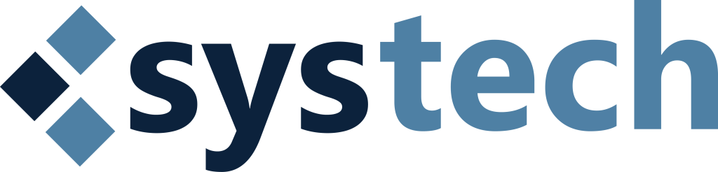
Three squares, interconnected
Systems, technology and human ingenuity. Each square is distinct and all three are joined, which is the argument the company has been making since 2017: the parts only matter if they talk to each other.
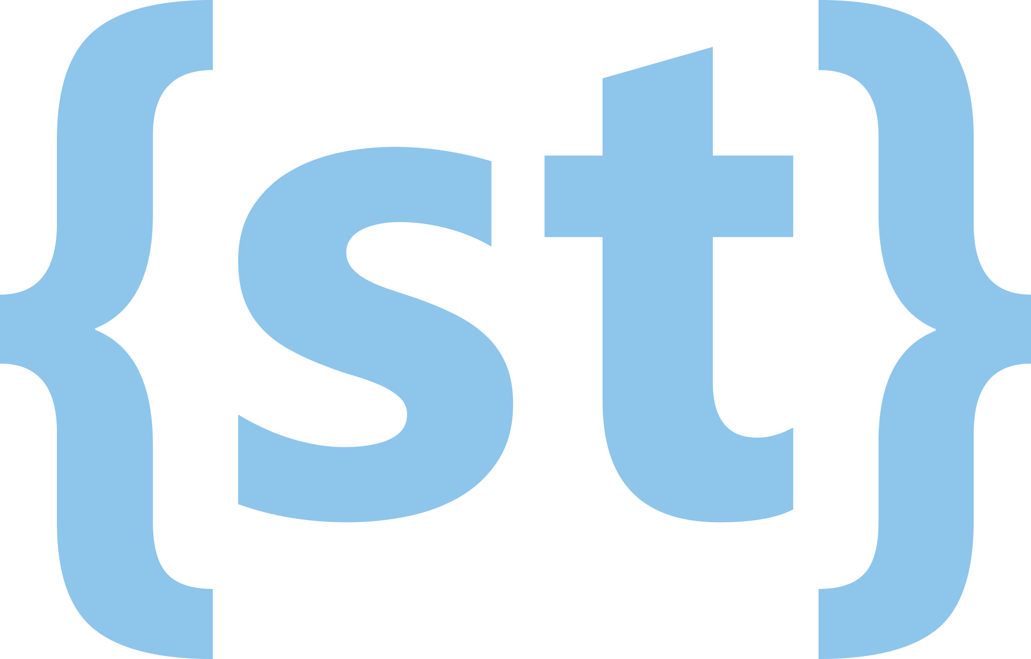
A block of code, holding a name
Curly braces are where a block of code opens and closes. Putting the brand inside them was never accidental. The icon is a nod to the founders' road from coders to entrepreneurs, and a reminder of where the instinct came from.
The corners are soft on purpose too. Sharp ninety-degree corners read as precise, and also as cold. Rounded ones sit between the meticulous world of the technology and the messier world of the people using it. That curve is on every button, card and panel systech ships, and it is the ethos drawn rather than written.
Chapter six Each hue is a chapter
You have met legacy blue. Here is the rest of the cast.
-
System Blue
The depth of knowledge and expertise ingrained in the company's DNA. Not just IT solutions but a wealth of understanding that turns technical support into something closer to a craft.
#0d233d
-
Tech Yellow
Innovation, and relentless improvement. It marks the path toward solutions built for the business in front of us rather than assembled from a catalog, and it is the color of a problem that turned into room to grow.
#fdca10
-
Software Blue
Limitless possibility. A journey not confined to the present but always exploring new horizons, and bringing clients along on the voyage rather than reporting back from it.
#8dc5eb
-
Grounded Grey
Grounded, solid, unyielding. The pillar. A constant in a world of variables, and the rock-solid assurance that in an industry which changes every eighteen months, the partner does not.
#616261
Chapter seven Four words that predate the logo
Grounded grey has a job, and these are it.
-
Honesty
Recommendations you can see the reasoning behind, including the ones that cost us the sale.
-
Integrity
The scope is the scope. Surprise costs are a failure of planning, not a line item.
-
Loyalty
Clients who signed on in 2017 are still clients. That is the number we watch.
-
Delivery
Closed tickets and a local person who answers. The rest is conversation.
And finally All of this is written down
Everything above has a specification behind it. If you are writing about us, sponsoring alongside us or building something that has to sit next to our logo, take what you need.
Brand Identity Guide
The full BiG. Logo construction, clearspace, typography, the complete palette and the lowercase standard, measured.
Read the guide ZIPLogo pack
Primary logo, icon and every approved alternate, for light grounds and dark.
Get the assets WEBMedia kit
Boilerplate, leadership bios, headshots, company facts and social assets for press and partners.
Open the media kit WEBCommunity
Where the team shows up when nobody is paying us to, and how to ask for support.
See community involvementNext chapter A legacy is also what you give back
The story above is about how the company got built. The next page is about where it shows up: the kind of local organizations the team supports, the hours donated and the work that happens with no invoice attached.
Every color, each hue, is a chapter in a story that isn't about bits and bytes but about people, dreams and the unwavering commitment to turning those dreams into something real for every client we are privileged to serve.