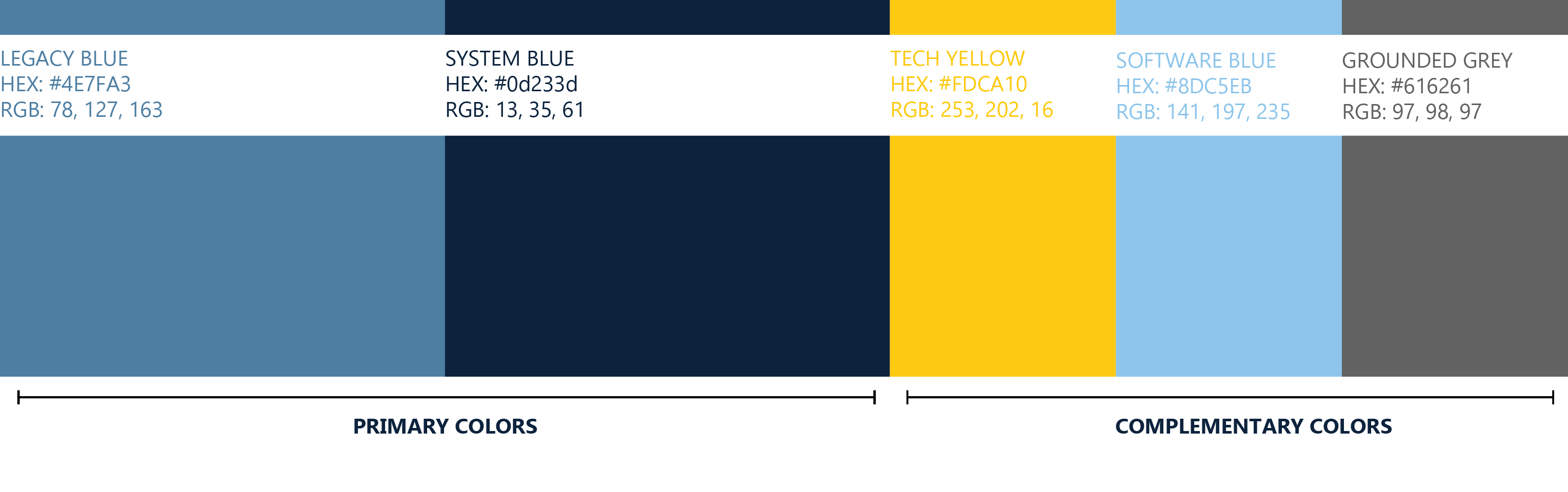
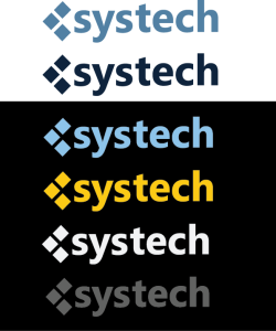
BRAND
IDENTITY
GUIDE

WELCOME

Welcome to the systech Brand Identity Guide {BiG}.

This guide is a comprehensive document that outlines the visual elements that define our brand, including logo, icon, color, typography, and visual identity. It’s a toolkit for consistently portraying our brand’s identity.

Legacy

This isn’t just a brand; it’s a legacy. It symbolizes the personal journey of the company's founder and echoes the depth of commitment to every client.

Mission

At systech, our mission is to deliver reliable and cost-effective solutions through innovation and advancements in technology. We value honesty, integrity, loyalty and delivery as we aim to provide the most efficient design to operate and grow small to medium businesses without technology or infrastructure standing in the way.

LOGO

Logo Introduction

The systech logo elegantly combines three interconnected squares with the crisp “systech” wordmark. The squares symbolize the seamless integration of systems, technology, and human ingenuity, reflecting the brand’s commitment to innovation and interconnectedness. Each square, while distinct, is interconnected, signifying the harmonious unison of diverse technologies to create holistic solutions. The “systech” wordmark, written in a sleek, modern typeface, grounds the symbol with clarity and precision, emphasizing the brand’s identity as a leader in delivering cutting-edge, reliable tech solutions. Together, they encapsulate systech’s essence—where innovation, reliability, and human ingenuity converge.

Icon

The {st} icon is a nod to systech’s roots in development, embodying the founders’ journey from coders to entrepreneurs. It encapsulates the precision and innovation inherent in technology and coding while symbolizing the integration of systems and technology. As a representation of systech, {st} signifies a blend of technical expertise and creative innovation, marking every product as a piece of a journey from lines of code to a nationally recognized brand. Every interaction with systech is a step into a world where technology and human experience merge, echoing the founders’ own evolution.

Logo Clearspace

When using the logo in a design or placing it next to other visual elements, you should ensure that it has plenty of room to breathe. This is where clearspace comes into play. The logo’s clearspace defines the distance between the logo and any graphic element it may be sitting next to in a composition. Use the cap height from the wordmark as a reference for the appropriate clearspace. 

typography

Primary Typeface

Ebrima, in its bold and regular weights, serves as our chosen typeface for headlines and sub-headlines, embodying the sleek, modern ethos of systech. Its clean, geometric shapes and open forms echo our commitment to clarity, efficiency, and innovation. In bold, Ebrima commands attention and exudes confidence, encapsulating our authority and expertise in the realm of managed IT services. In its regular weight, it maintains readability and elegance, ensuring that every word resonates with our audience, mirroring the accessible, client-centric nature of systech. Together, these weights create a visual harmony that is as informational as it is engaging, anchoring our brand’s voice in every message conveyed.

Typeface Pairing and Usage

When it comes to body copy or instances where Ebrima is not available, Open Sans steps in as the reliable alternative, ensuring that systech’s communication remains consistent and effective. Characterized by its clean lines and excellent readability, Open Sans embodies simplicity and modernity. Its humanist qualities make it not just easily readable but also friendly and approachable, aligning with systech’s commitment to accessibility and client-centric communication. Each character is designed for optimal legibility, ensuring that our message is not just seen but is also absorbed, understood, and remembered, echoing the clarity and precision that defines systech.

Brand Color

Brand Color

systech is not just rooted in technology but is a tapestry of human connection, personal journey, and relentless pursuit of excellence. The legacy blue, with its personal significance to the founder, serves as a bridge linking the deeply technical and profoundly human aspects of the service. It’s a reassurance that every piece of technology deployed, every solution provided, is imbued with a personal touch, echoing the ethos that technology is, at its core, about connecting, empowering, and transforming lives. 

Each color, each hue is a chapter in a story that isn’t just about bits and bytes but about people, dreams, and the unwavering commitment to turning those dreams into tangible realities for every client that the company is privileged to serve.

Legacy Blue

This isn’t just a color; it’s a legacy. It symbolizes the personal journey of the company’s founder and echoes the depth of commitment to every client. Each hue of the legacy blue is a testament to years of tenacity, innovation, and a relentless pursuit of excellence. For clients, it’s a reminder that they are not just engaging with a service provider but are part of a story woven with dedication and personalized attention.

System Blue

It mirrors the depth of knowledge and expertise ingrained in the company’s DNA. Every strand of this dark blue resonates with the profound insights and vast experience that the team brings to the table. It’s not just about IT solutions; it’s about a wealth of understanding that transforms technical support into an art, making every client interaction a masterpiece of precision and efficiency.

Tech Yellow

Tech yellow is a symbol of innovation, and relentless improvement. It underscores the company’s commitment to illuminating the path with cutting-edge, bespoke IT solutions that aren’t just about meeting needs but exceeding expectations, turning every challenge into an opportunity for growth.

Software Blue

This color signifies the limitless possibilities and boundless innovations that the company infuses into its IT services. It’s a promise of a journey that’s not confined by the present but is always soaring, exploring new horizons, and bringing clients along in this voyage of discovery and innovation.

Grounded Grey

Grounded, solid, unyielding – this grey is the pillar, echoing the company’s unwavering reliability. It’s a constant in a world of variables, a rock-solid assurance that in the ever-evolving landscape of technology, the company is the steadfast partner that clients can always rely on.

Visual identity

The case for lowercase

This typographic choice communicates innovation. It defies traditional norms, showcasing systech as a forward-thinking entity that transcends conventional boundaries and is always on the frontier of technological advancements.

Rule: The Ever-Present Lowercase

By consistently presenting “systech” in lowercase, we make a powerful statement about accessibility and inclusivity. In a domain often characterized by complexity and hierarchy, the lowercase denotes approachability and attainability for all.

Strict Adherence, with One Exception

The sanctity of the lowercase “systech” is to be maintained in every piece of communication, official document, digital platform, and marketing material. The rule is absolute, underscoring the consistency that is integral to our brand identity.

The only deviation permitted from this steadfast rule is in the context of specific marketing schemes where an ALL CAPS design is employed for headlines. This exception is allowed to cater to creative flexibility and impact in marketing, without compromising the brand’s core identity.

UX/UI Design Standards

In the landscape of managed IT services, where technical precision and technological advancements are the benchmarks of quality, systech takes a step further. We elevate our brand by intertwining technical excellence with a warm, human touch, an ethos that is visually represented through our preference for rounded, soft corners.

NOTE: Contrast Colors UI/UX

Always use Primary and Secondary colors for prime contrast in UserInterface situations. Alternative colors can be used when needed for separation from background. 

Precision Meets Approachability

While sharp, 90° corners are synonymous with precision and accuracy, they can sometimes evoke a sense of rigidity and impersonality. In contrast, rounded corners bridge the gap between the meticulous world of technology and the nuanced, emotive world of human interaction. They symbolize systech’s commitment not just to technological innovation but also to creating a client experience that’s as warm and welcoming as it is cutting-edge.

The {st} icon, a visual cornerstone of systech’s identity, features curves and soft edges that echo the essence of accessibility, approachability, and fluidity. The rounded brackets encapsulate not just the letters but the very ethos of systech – a brand defined by seamless integration, adaptability, and a nuanced, client-focused approach.

Imagery plays a pivotal role in bringing systech’s brand identity to life. Our images are more than visual content; they are narrators that weave the complex, yet harmonious tapestry of our brand’s story, values, and the deep connection we nurture with our clients.

Technology and Humanity

Our images strike a delicate balance between showcasing cutting-edge technology and the human element. They depict innovation, precision, and efficiency while highlighting the personalized, client-centric approach that defines our services.

Style and Tone

At systech, our images are characterized by a blend of sophistication, innovation, and human touch. We select images that resonate with the serene confidence emanating from our legacy blue, the depth of our expertise represented by system blue, and the vibrant energy, innovation, and optimism signified by our vibrant tech yellow.

Every employee, partner, vendor and client is urged to adhere strictly to this lowercase rule. It’s not merely a typographical preference but a core component of our identity.

DO’s

  • Use “systech” in lowercase in every scenario and context to maintain brand consistency.
  • Ensure that every representation of the brand name, both internal and external, adheres to this rule.

DON’Ts

  • Avoid capitalizing the “s” in “systech,” even when it occurs at the beginning of sentences or in titles and headers, except for the stated exception.
  • Do not overlook this rule in formal documents; consistency is crucial in every touchpoint of our brand expression.

In embodying the essence of systech, the consistent use of lowercase serves as a visual and symbolic anchor of our brand’s identity. Each occurrence is a subtle yet potent reminder of our ethos – where every client, every project, is approached with a blend of innovative spirit, accessibility, and a deeply human touch. 

Alternate Logo Use and Misuse

Every application of the systech logo should adhere to spacing and sizing guidelines to ensure brand consistency, recognizability, and professionalism across all platforms and materials.

ICON

In scenarios where space is limited, a simplified version of the logo, maintaining key elements, may be used to ensure visibility and recognition.

Alternate Monochromatic Colors

Where color printing is not available or appropriate, a monochrome version of the logo can be utilized, adhering to the approved color variations.

Parameters for Alternative Logo Usage

At systech, we recognize the necessity for flexibility and adaptability in the dynamic landscape of branding and visual communication. While maintaining the integrity of our brand identity is paramount, there are instances where alternative logo variations may be appropriate to ensure optimal visual communication and engagement.

Context Sensitivity

Alternative logo usage is permitted when the primary logo does not suit the specific context or medium, ensuring that the brand identity is adaptable yet consistent across diverse platforms and scenarios.

Design Integrity

Any alternative logo must retain the core elements and essence of the primary logo, ensuring that the brand’s visual identity remains recognizable and cohesive.

All alternative logo variations must be approved by the designated brand authority within systech to ensure they align with the overall brand identity and values.

Alternate Logo Use and Misuse

Every application of the systech logo should adhere to spacing and sizing guidelines to ensure brand consistency, recognizability, and professionalism across all platforms and materials. 

Do Ensure

  • That the alternative logo respects the core design principles and elements of the primary logo.
  • Seek approval before implementing any alternative logo to ensure brand consistency.

Do Not

  • Modify or create an alternative logo without adherence to the established guidelines and approval processes.
  • Use the alternative logo as a replacement for the primary logo across standard communications or platforms.

The Balance of Consistency and Flexibility

The allowance for alternative logo usage underscores systech’s commitment to being a dynamic and adaptable brand, capable of evolving without compromising its foundational identity. Every alternative logo is not just a visual element but a nuanced expression of systech, echoing the intricate dance of consistency and flexibility that defines our brand in the ever-evolving world of technology and communication.


Do Not Skew, Squish nor Slant. Do Not add Gradients, Change Ratio nor Adjust Symbol to Wordmark Configuration. Do Not Use Non-approved Colors.expression of systech, echoing the intricate dance of consistency and flexibility that defines our brand in the ever-evolving world of technology and communication.

info@systech.io 

www.systech.io

541-696-5555

All Rights Reserved © Copyright 2023, Systech Consulting, LLC

Unrivaled Support

The Most Trusted Tech Solution Southwest Oregon

systech is Unmatched in Expertise